In this special 65th-anniversary blog, we’re taking a journey back in time to explore how West End Rad’s brand has changed and evolved since 1960.

When West End Rad opened in 1960, our logo looked nothing like it does now. While our core values have stayed the same, our look has changed dramatically over the decades.
Join us as we look back at the evolution of our brand and how we arrived at where we are today!
West End Rad’s Original Logo

From the early 1960s through the 2000s, our brand existed solely on the logo displayed on our building.
At the time, it didn’t appear online. So, its main purpose was to mark our location in Winnipeg and make West End Rad a familiar presence in the neighbourhood.
The original letters are curly and reminiscent of the groovy fonts commonly used in the 70s and 80s.
However, our signature shades of blue were not yet there.
They came later, as our brand began to grow beyond just being a logo on our building.
West End Rad’s First Website

In the late 1990s to the early 2000s, businesses across the world started creating websites to start showing up online.
As a result, this changed how brands and logos were shared and recognized.
This was the first version of our logo to include colour, with the ‘West End’ portion in light blue.
In hindsight, perhaps drawing inspiration from Star Trek?
Although the blues used in this logo and on this version of our website differ from the shades we use today, they strongly influenced the our current colour palette.
Ultimately, this version of our logo and website helped shape the contrast between a darker blue and a lighter blue that continues to define our look.
Our Shift Toward a Stronger Logo

By 2016, our logo evolved from the soft, rounded style from the early 2000s to a sharper, more defined design.
We added an underline to reinforce the West End Radiators name and make it stand out more.
Additionally, our design moved closer to the dark blue used in our current logo.
Investing In The Brand
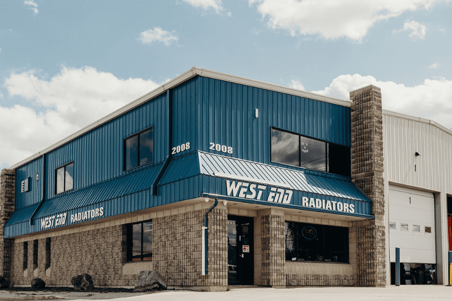
West End Rad’s 2016 logo at our Winnipeg service location
The overall look of our brand became more modern between 2010-2020.
This reflected our position as an established leader in the heavy-duty cooling system industry.
Our marketing team continue to push investing in brand to help differentiate our rad shop from Canadian competitors.
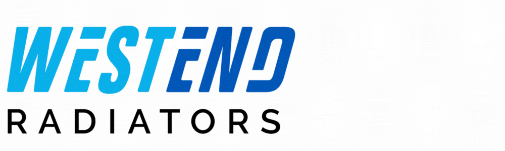
West End Rad’s Current Logo
Today, our logo is the one most people recognize. It’s the version that appears across our website, signage and merch.

Our current logo combines the light blue and dark blue of our old logos for a modern design that defines our brand.
Because of this powerful design and bold colour combo, our logo is bold and easy to recognize, whether it’s seen online or in person.
West End Rad’s 65th Anniversary Logo
To mark 65 years of West End Radiators, we created a special anniversary logo, designed to celebrate the history of the brand while still feeling connected to our current look.
This logo uses the colours and design our audience already recognizes, while adding a fun and eye-catching animation that draws attention to our 65 years of leading the industrial cooling industry.
Check out our 65th anniversary landing page for more exciting news, content, events and more!